No resident wakes up thinking about signage.
No property manager checks a dashboard labeled “sign success.”
And no developer cuts a ribbon celebrating perfect room identification.
Yet when signage fails, everyone notices immediately.
The irony of great signage is that it disappears.
People glide through the property without stopping to think. Guests arrive without calling for directions. Delivery drivers don’t wander hallways. Residents don’t double-check doors. Accessibility features work quietly, without explanation or apology.
This is what success looks like.
Signage interacts with people constantly, but almost always subconsciously. It is read in passing, interpreted in motion, and trusted without question. When signs are placed correctly, worded clearly, and designed with restraint, they create a sense of instinctive orientation. People feel like they know where they are — even if they’ve never been there before.
Poor signage, on the other hand, interrupts movement. It forces pauses. People stop, look around, question themselves. They ask staff. They backtrack. They lose trust in the environment.
Those moments add up.
In apartment communities, signage shapes daily rhythms. Residents follow the same paths again and again — from parking to units, from elevators to amenities, from mailrooms to exits. Over time, signage becomes part of the property’s mental map. If that map is unclear or inconsistent, frustration quietly settles in.
Accessibility sharpens this reality. For residents who rely on tactile and braille signage, clarity is not just helpful — it’s foundational. Well-designed ADA signage gives independence without instruction. It allows people to navigate confidently, without drawing attention to the fact that they need support at all. That dignity is built into the signage itself.
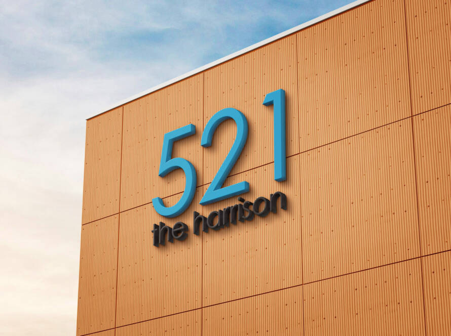
Aesthetic coherence plays a role too. Signage that aligns with architecture and interiors reinforces the idea that the space is well-considered. When fonts, finishes, and layouts remain consistent, the property feels intentional. Not flashy. Not overdesigned. Just right.
The best compliment signage can receive isn’t praise — it’s silence.
At MAWBRA INC, signage is designed to vanish into the environment while doing precise, demanding work in the background. Every decision is made with repeated use in mind. Every sign is built knowing it will be seen thousands of times without ceremony.
When signage becomes invisible, residents feel comfortable.
Property teams feel fewer disruptions.
Developers feel fewer close-out headaches.
And no one needs to talk about it.
Because when signage works, life simply flows.